About the Client
The Graduate School is an advocate for knowledge and support for the research-based graduate programs, scholars, and students at the University of Minnesota. They promote forward-looking dialogue around contemporary issues of significance and ensure quality education for students.
As Minnesota’s only research institution, they offer 170+ distinct programs in multiple locations. Students enjoy an unmatched breadth, depth, and caliber of interdisciplinary study, community impact, practical application, and compelling scholarship.
Secondary audiences
Faculty
Staff
Postdocs*
Key Audiences
Prospective Graduate Students
Current Graduate Students
Graduate Program Coordinators (GPCs)
About the PROJECT
Challenge
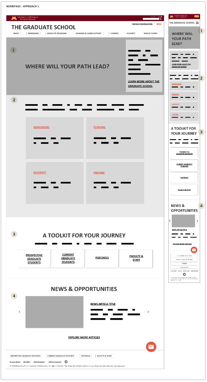
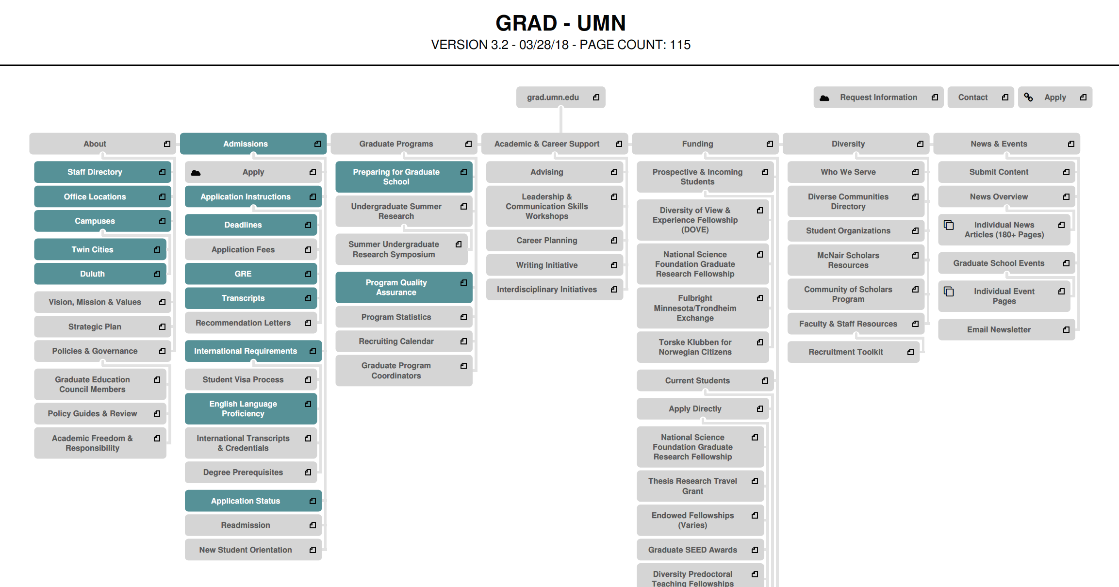
The Graduate School needed to redesign its website. There were misconceptions of who the Graduate School was and what it does within the university. Its responsibilities and structure changed several times over the past 10 years, and the website was more a collection of links than a useful resource. Students and staff couldn't find information on the 1000-page site, and were not confident on its accuracy.
Project Objectives
Improve the user experience to reflect the Graduate School’s infrastructure and new strategic plan (brand positioning, messaging, and visual identity).
The key measurable areas focused on:
Provide easy access to the information key audiences expected to find.
Highlight student excellence in graduate education and postdoctoral training.
Focus content on areas the Graduate School oversees: advocacy of graduate and postdoctoral work, funding opportunities, application and policies, diversity support and initiatives, and international student requirements.
New Website Strategy & Tactics
Site architecture
Messaging approach
Content strategy
WCAG 2.0 Level AA accessibility standards
Wireframing
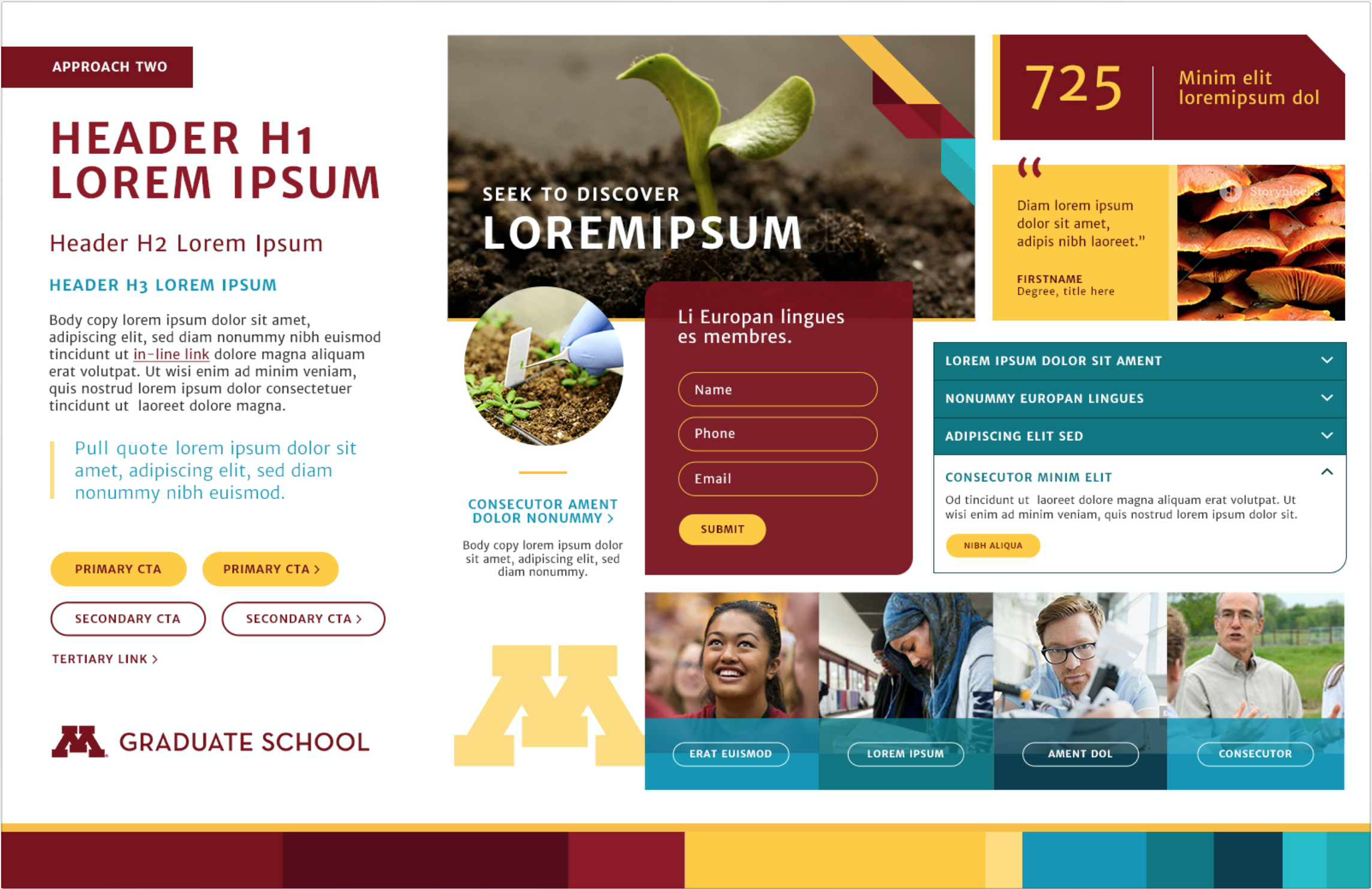
Style tiles
Design
Research Tactics
Current website health assessment
Focus groups
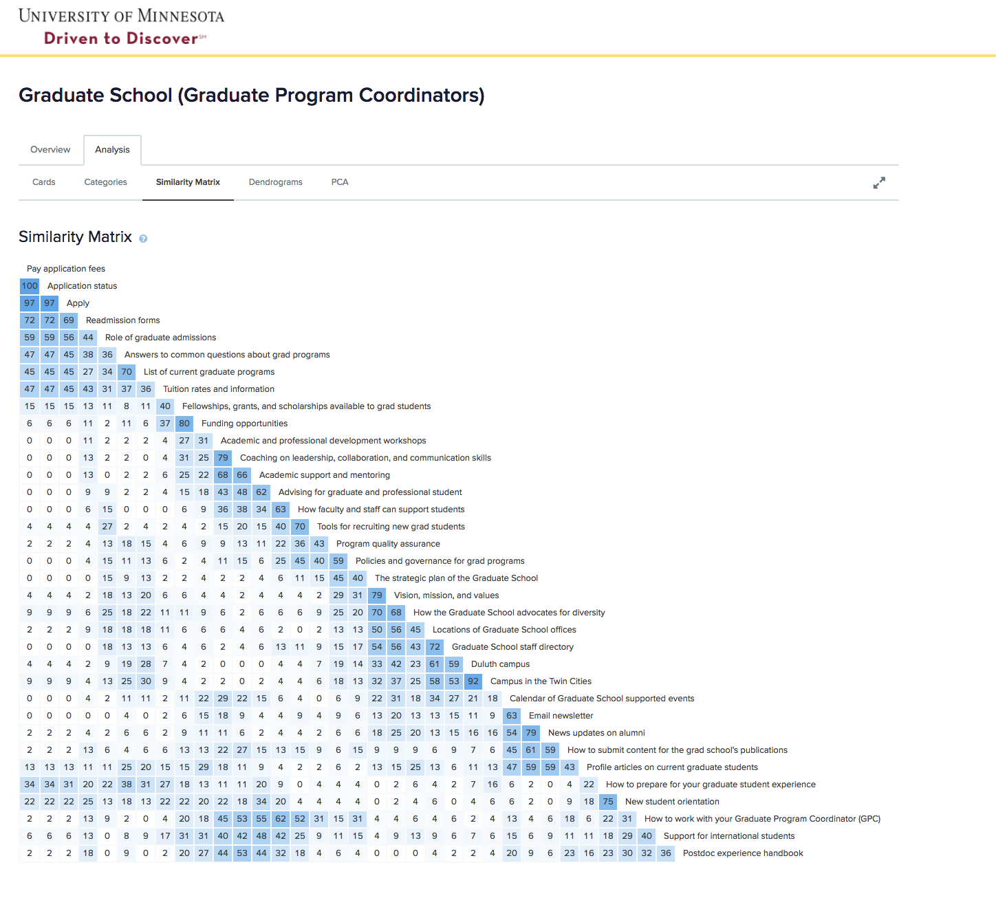
Card sorting
Blank page testing
Internal stakeholder discovery sessions
Project Highlights
Brought the website size down from 1,000 pages to 300 pages focused on user needs.
Educated stakeholders on how the new visual identity (developed by a group on campus) would be used to meet accessibility standards.
Discovered terminology such as “diversity” were misunderstood by key audiences. This was a major focus to improve during the content strategy phase since it affected student's awareness of programs and grants.
Because the Graduate School attracts a high number of international students we helped them take reading level into account for their new content development strategy.
*During our research, it was discovered that the Graduate School doesn’t offer enough services to warrant the postdocs’ time or attention. Future postdoc research will be done by the Graduate School post launch of the website.