
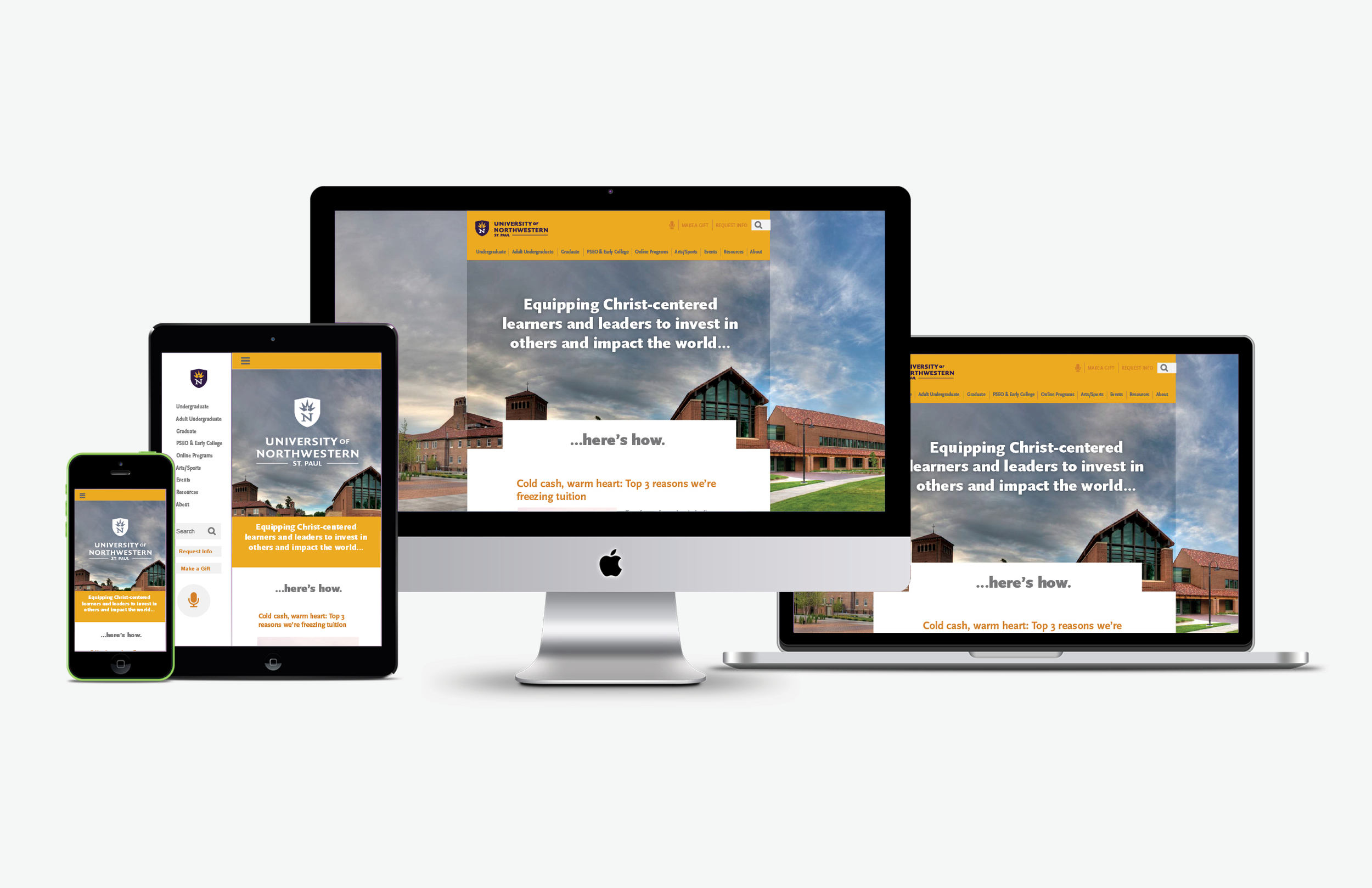
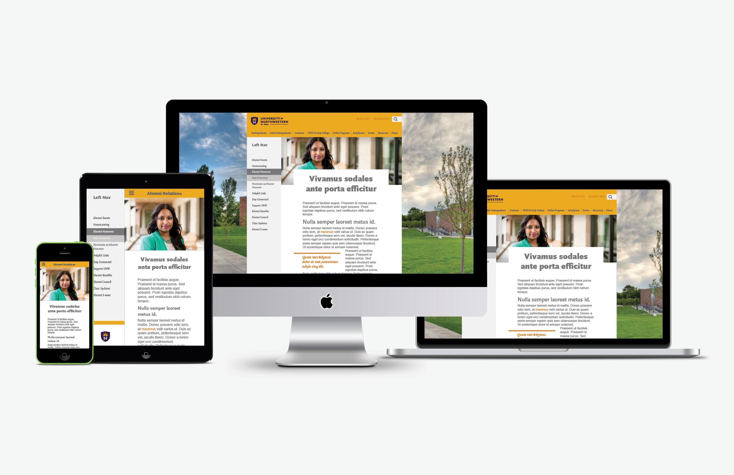
The goal of the new University of Northwestern institutional website is to unite all five venues into one responsive wireframe and help users get to the knowledge they need more readily. At the same time they want to relay their unique brand message: "Equipping Christ-centered learners and leaders to invest in others and impact the world." as it relates to each audience.
Key audiences: Prospective Students (Early College & PSEO, Traditional Undergraduate, Focus Adult Undergraduate, Graduate Studies, Online Programs.)
Secondary audiences: Alumni, Parents and Donors.
These audiences are defined into venues according to the communities they fall into. These are defined by the prospective student's age and education level. These venues are listed as: "Early College & PSEO", "Undergraduate", "Adult Undergraduate", "Graduate" and "Institutional". Online Learning and the secondary audiences fall under "Institutional" since their audiences cover aspects of Northwestern as a whole rather than being program specific.
Ideation & Prototyping
The Marketing & Communications team at Northwestern has performed several website updates within the past four years. Each of these was generally only for one venue at a time. Yet all those design updates went directly from a design mockup to production without any time for research and testing. Since this update would be a universal change for all five venues this opened the opportunity for a stronger emphasis on design thinking.
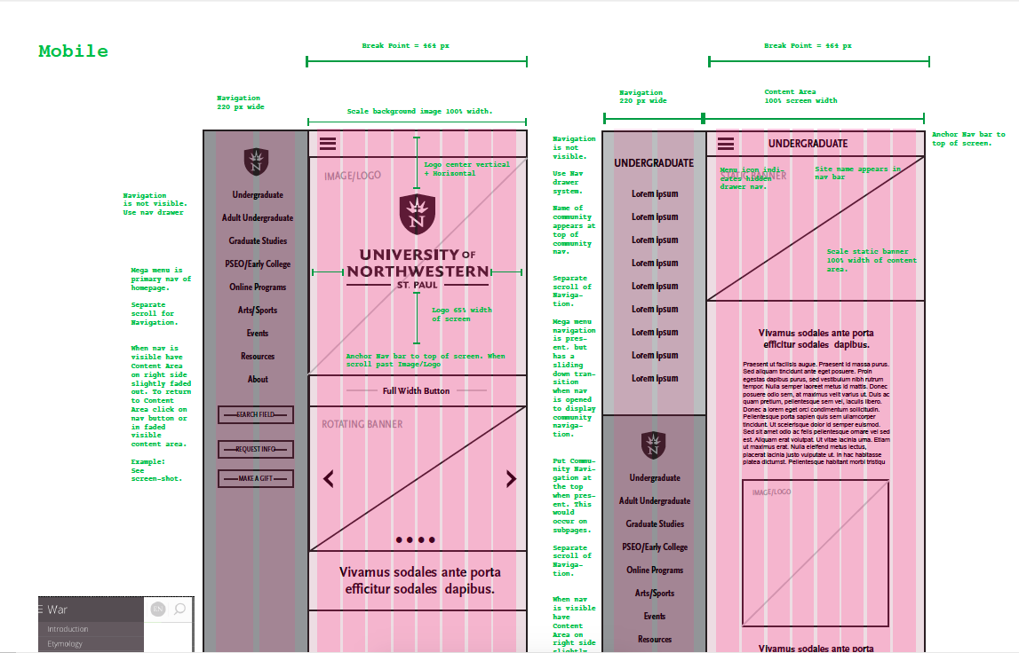
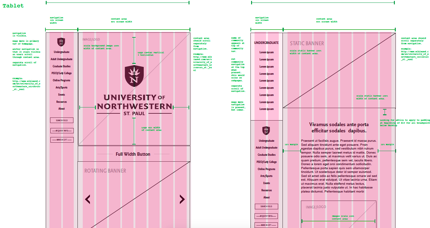
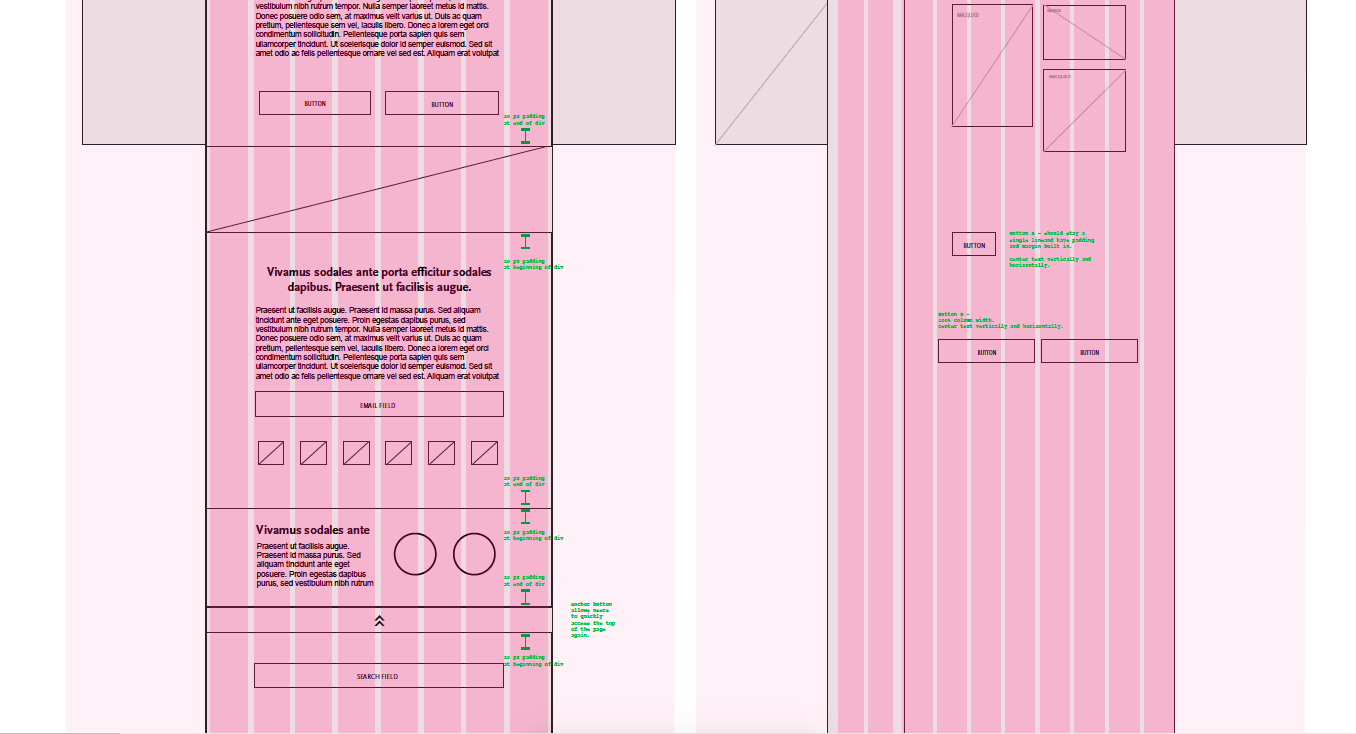
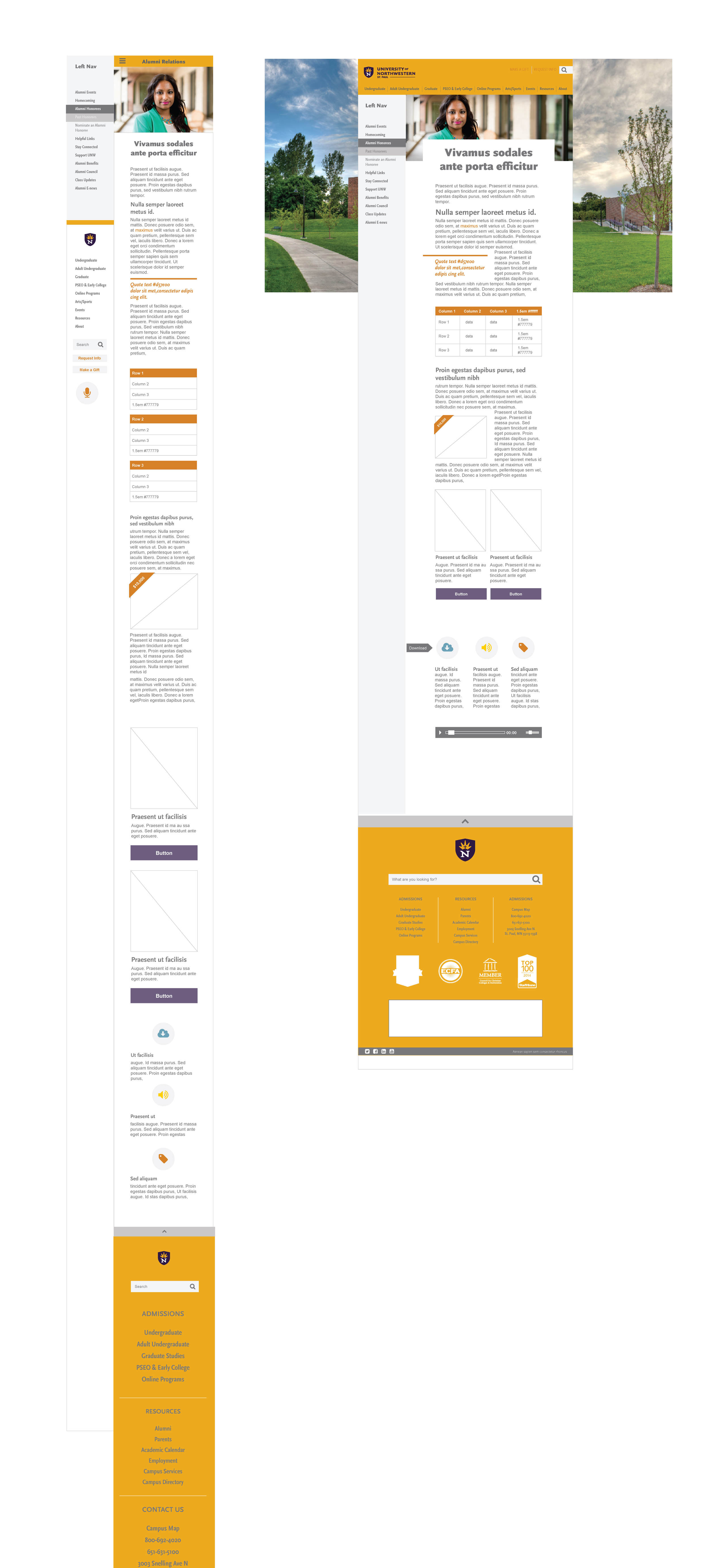
The first step we took in ideating what the new site could look like was to strip away all of the color and imagery and focus on functionality. Our team went to researching best UX practices along with studying the analytics of our current site. This allowed our team to ask questions and find solutions that would have been difficult to approach if visual branding had been established first. How did the user experience change when we start with mobile? What did our audience want to see? How does this contrast with what our organization wanted to showcase? What if we let people navigate the site by their venues? What quirks are there between the different audiences and the types of information that is displayed? How can content marketing play into how people navigate our site?
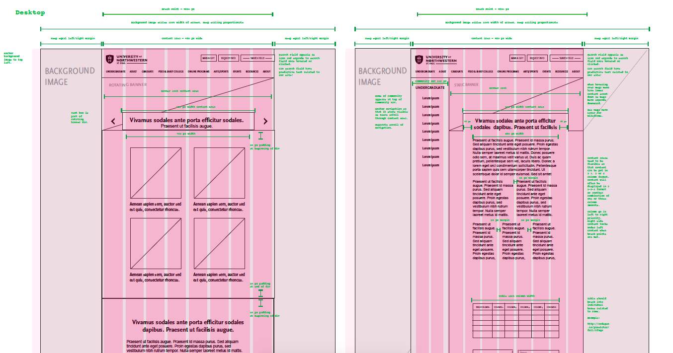
The next piece that needed to be addressed was how to make the site visually ADA compliant while still maintaining strong Northwestern branding on this 1,200 page / 5 venue website. This meant high contrast in colors would be important. Yet the colors needed be restrained enough not to confuse users on what their next action should be. I chose to use a simple pallet of nine colors (six colors, three greys) and two font families. In the web style guide these were then translated to the widgets which would be used universally on the site. By taking these steps it allowed us the opportunity to make sure there was a distinction between branding colors and action colors using a 60/30/10 ratio. This ratio of color usage stems from the color theory principle that suggests your primary color should cover 60% of all main UI elements unifying the theme of your design. Your secondary color should cover 30% to create visual interest and provide contrast. The last 10% should be an accent color to give your design that touch of elegance. For the Institutional site: 60% of the page would be white with 30% branded in UNW gold and 10% using the action color of purple.
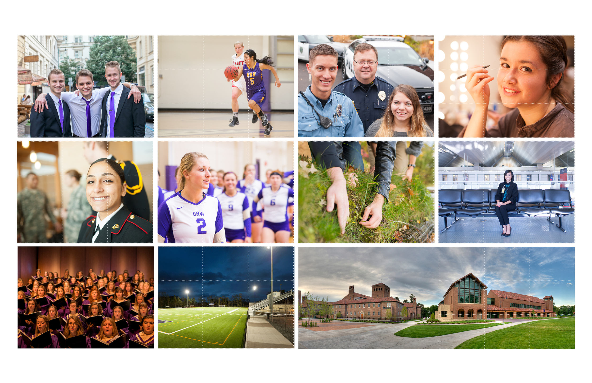
Previously the Institutional website had a high concentration of images on every page. While this offered a variety of depictions of who Northwestern is many times it created more clutter than clarity. For the new website we stripped away over 75% of the photos previously used and focused instead on a few select images that offered a strong emphasis on good quality campus photography.
From there, mockups of the site were made starting in mobile view and then in desktop. This allowed our internal team and outside development contractor to compare the functionality of each layout while understanding more of the complexities related to writing for mobile vs desktop. Testing and refinement then took place between the mockup stage and and test site.

Solution
The final solution to the site allowed for a smooth launch as more people were able to feed into the design earlier in the process. We also timed the soft launch of the website during a month of low traffic to the site so minor tweaks could be made as necessary. Overall reception of the site has been positive and allowed for new ways of sharing Northwestern materials through the new content marketing strategy. Read more about the specifics related to the Focus Adult Undergraduate and the Graduate Studies web updates.
Supporting Campaign Materials
Since Northwestern is evolving a "web centric" marketing strategy, all print and digital materials direct users back to the main Institutional website (unwsp.edu). The goal of these materials is to be seamless between the print and digital branding experience.


